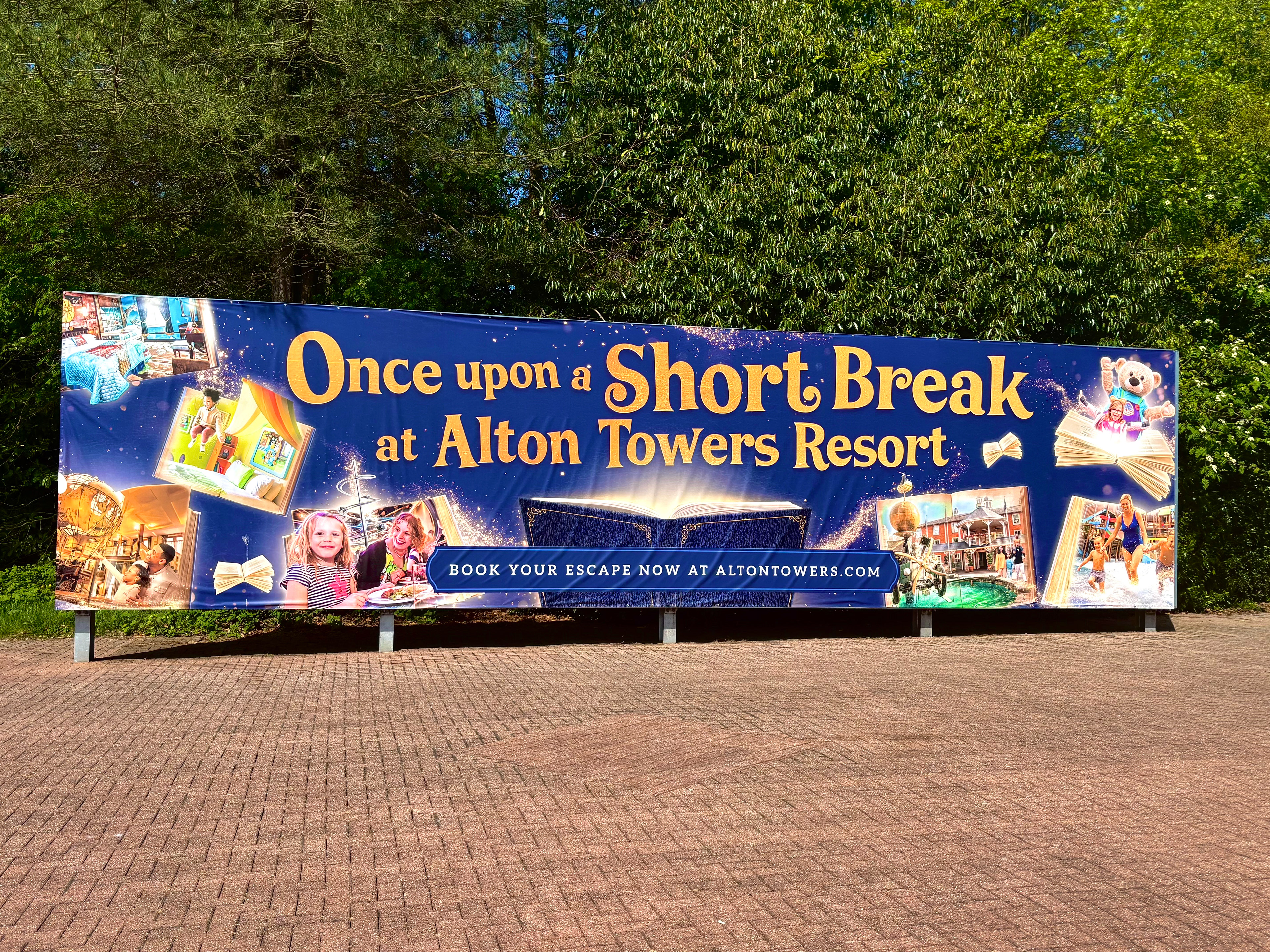
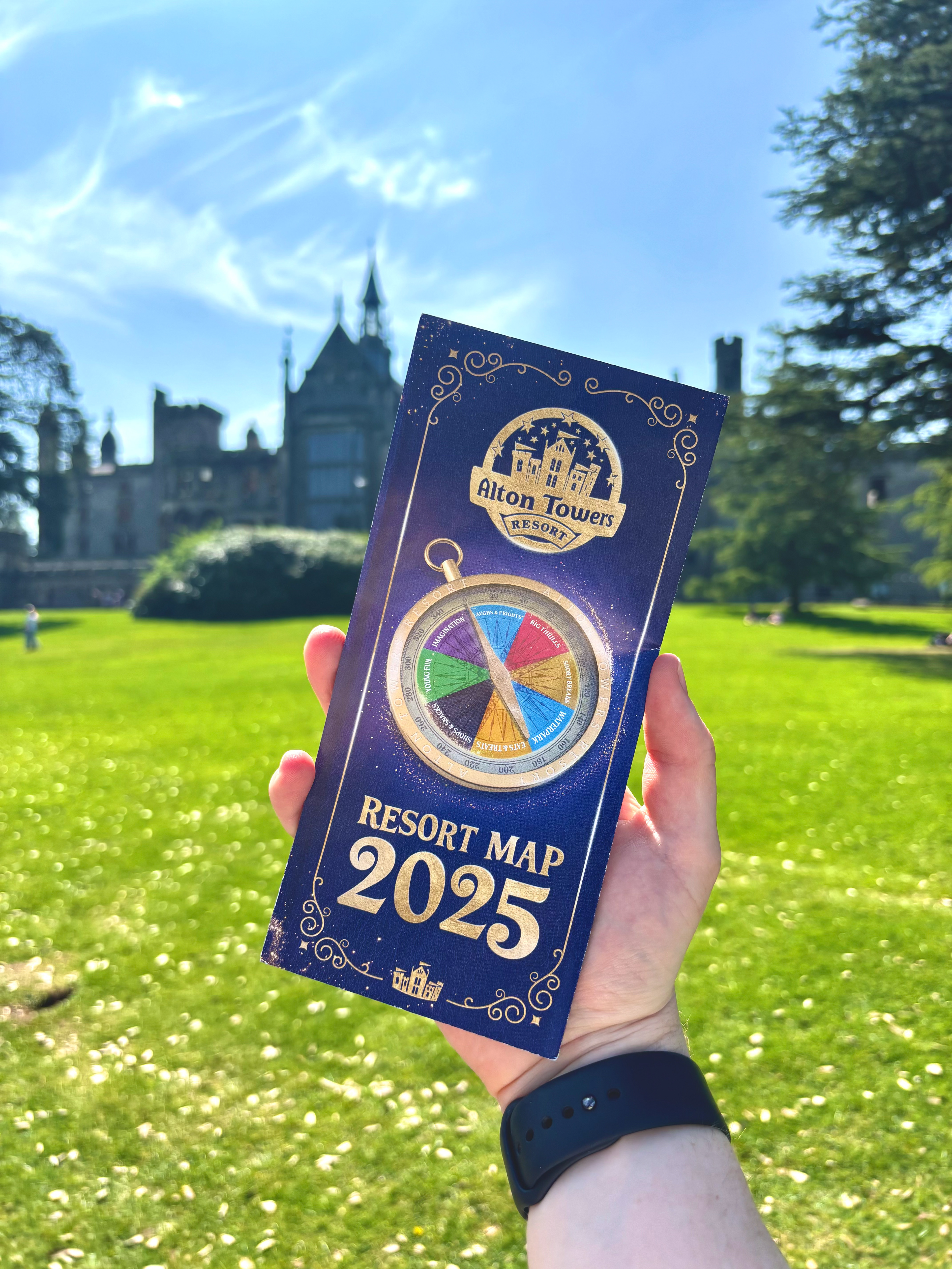
For 2025, the park aimed to give its look and feel a subtle refresh. In collaborating with the Resort, they sought to capture the nostalgic and whimsical vibes that have always been central to the brand.
We acknowledged that the brand had lost some of its magical charm in recent years, so I focused on adding plenty of quirky, enchanting details. We also drew inspiration from Alton Towers' rich history, incorporating their ornate, vintage signage styles to craft distinctive shapes for displaying typography and images.
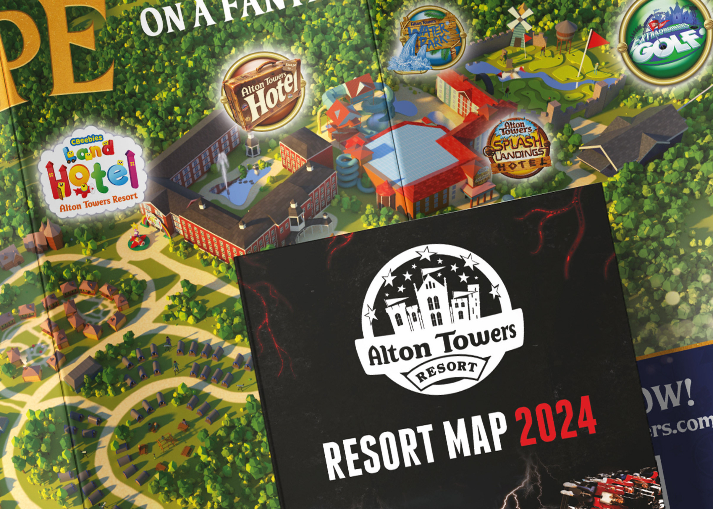
For the map, we brought back the nostalgic bubbles from the 2000s identity, adding a magical and modern touch. The cohesive look, featuring the dark blue leather texture and vintage frames, came together beautifully, providing a consistent design for the park to use throughout the 2025 season.

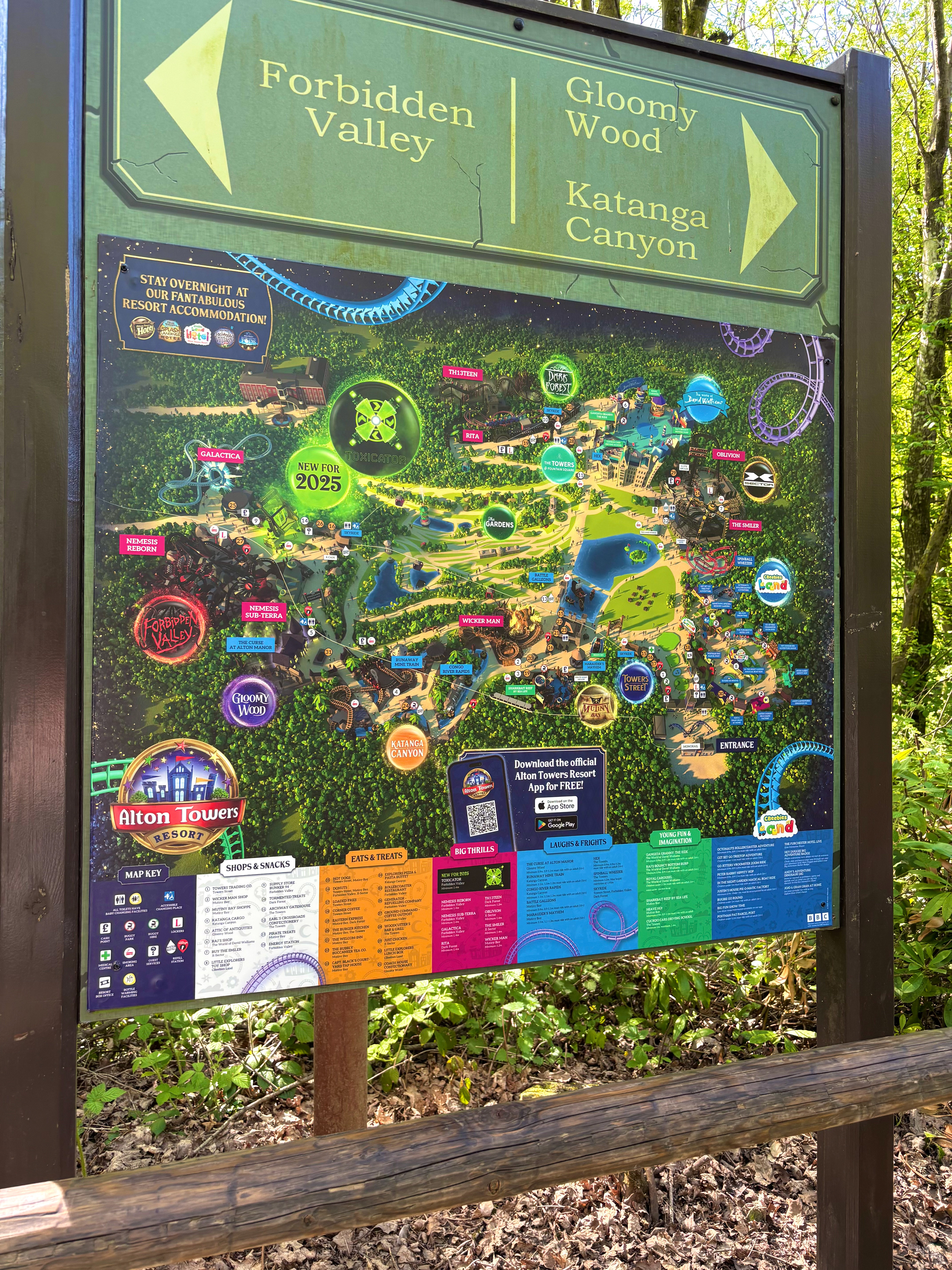
As in previous years, the map required an update for the park’s Scarefest event. This year, the client wanted a clearer distinction between thrill attractions and family-friendly experiences. To achieve this, we introduced a colour-coded design and divided the map into two sections.
Work completed at LMC Design 2025.
