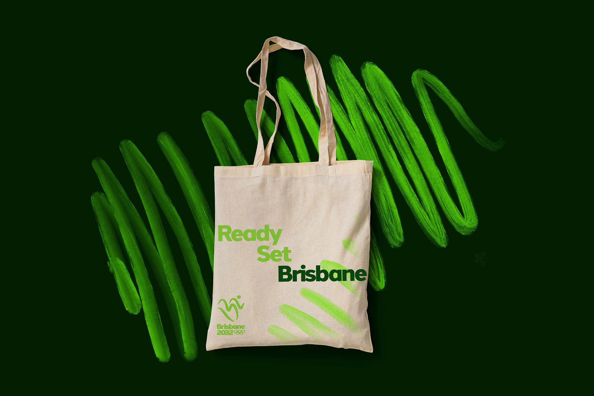

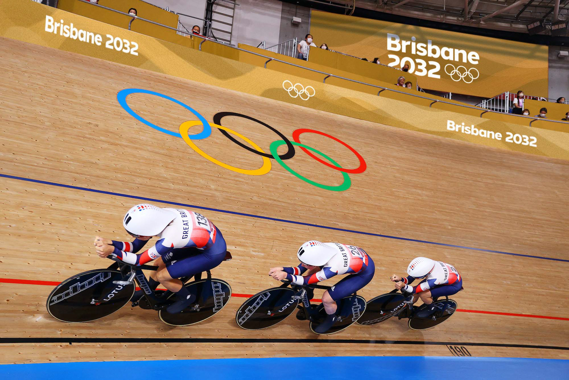
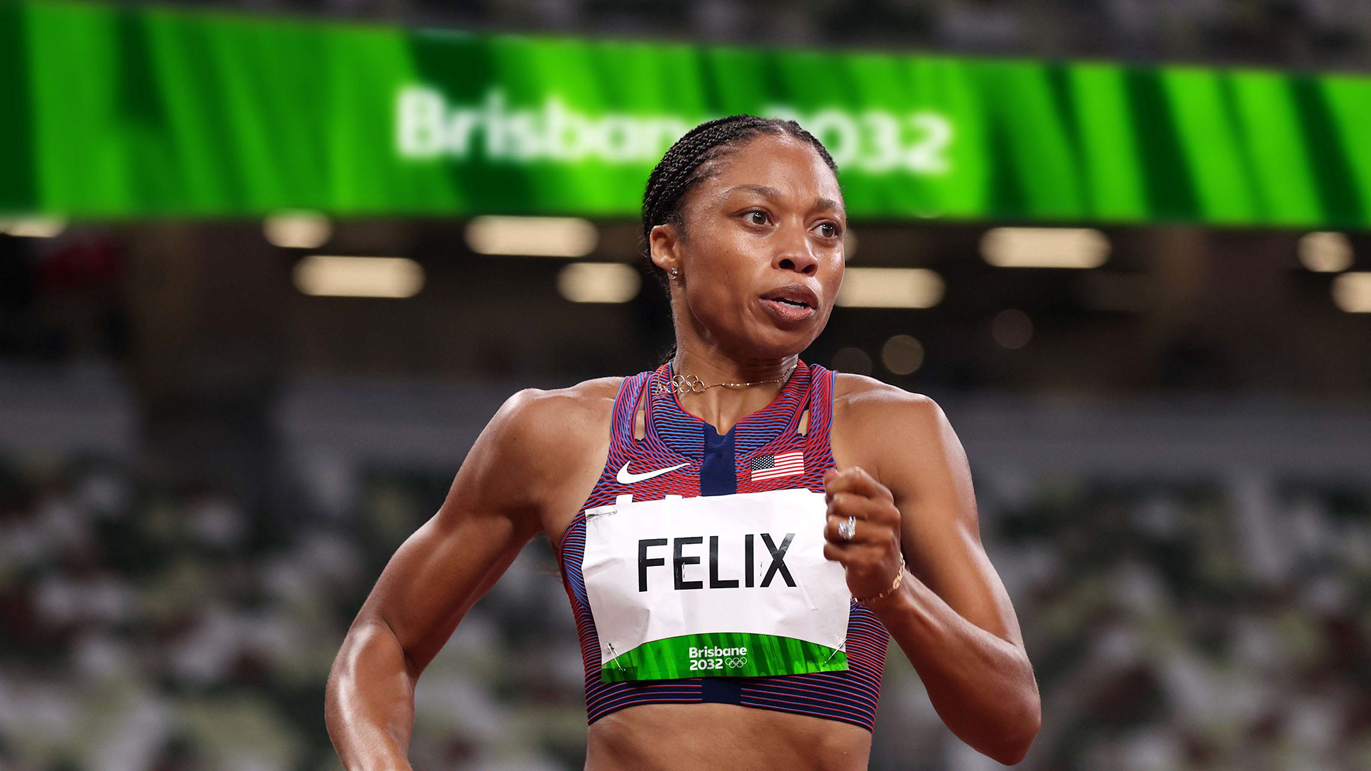
Brisbane has been selected as the host of the 2032 Summer Olympic Games. Usually a bid brand identity will be created and then redesigned closer towards the time, but with Brisbane, there is no identity at all. For my Final Major Project at Uni, I decided to create a full design system, motion and broadcast graphics for one of the biggest sporting events on the planet.
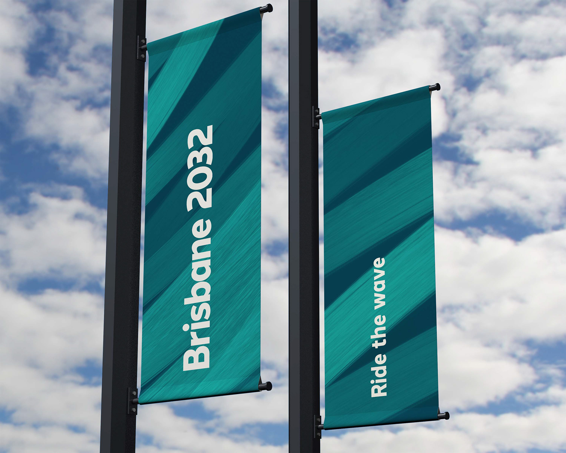
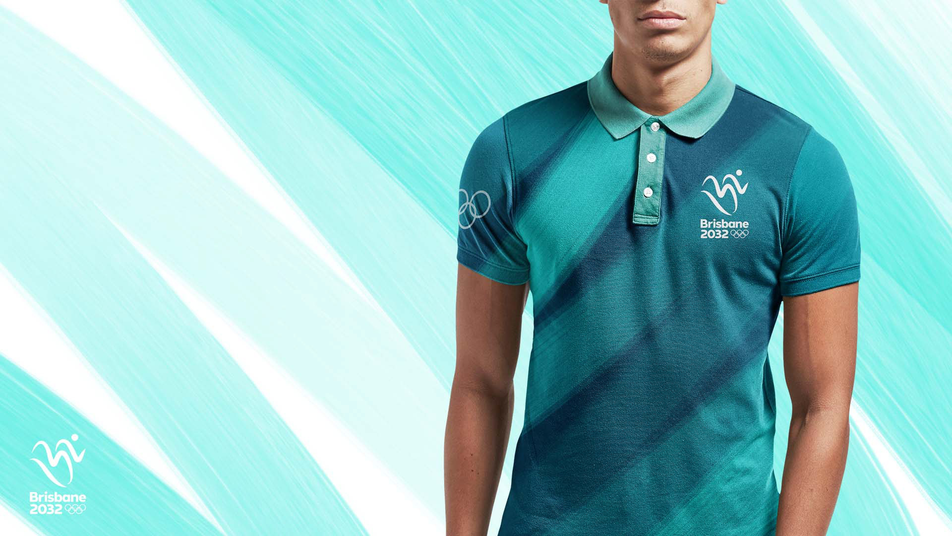
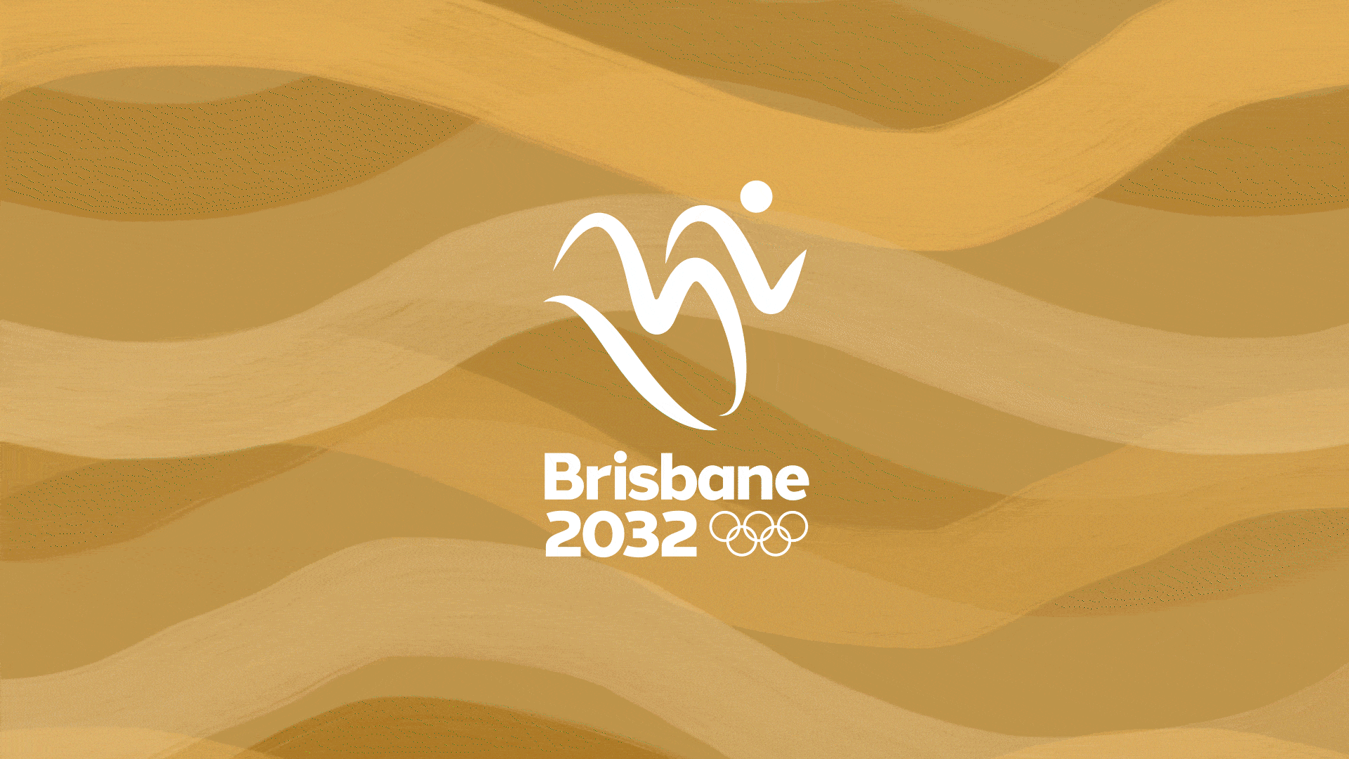
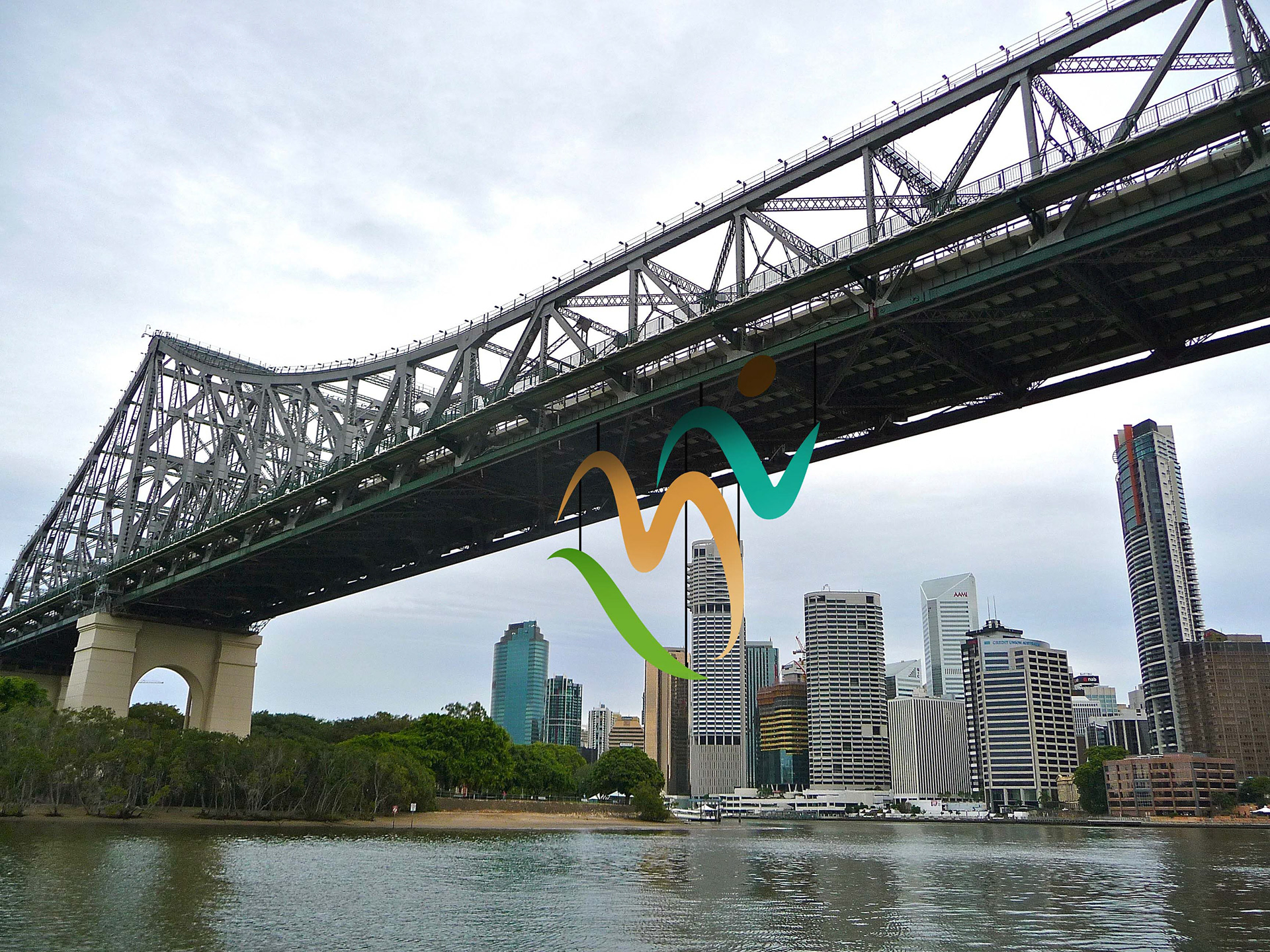
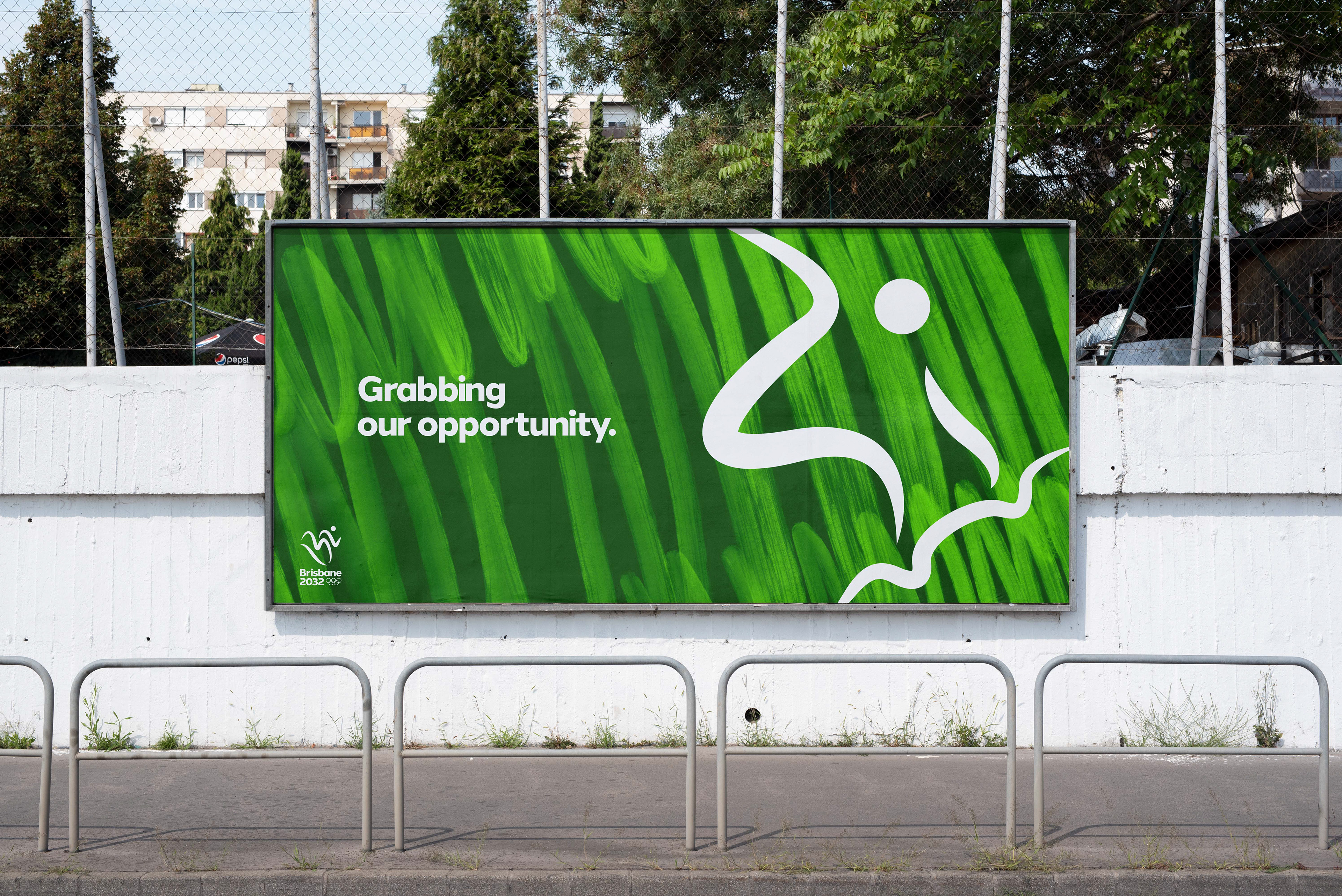
The 'wave' is the major asset in this identity. Inspired by the energetic waveform of Brisbane and its three distinct landscapes. The land, sand and sea. This relate to the vast array of sports the Olympic's show. The paint brush texture comes from Brisbane's heavily art-based culture. It also gives it an element of texture and humanism to a brand that is all about human and interaction.


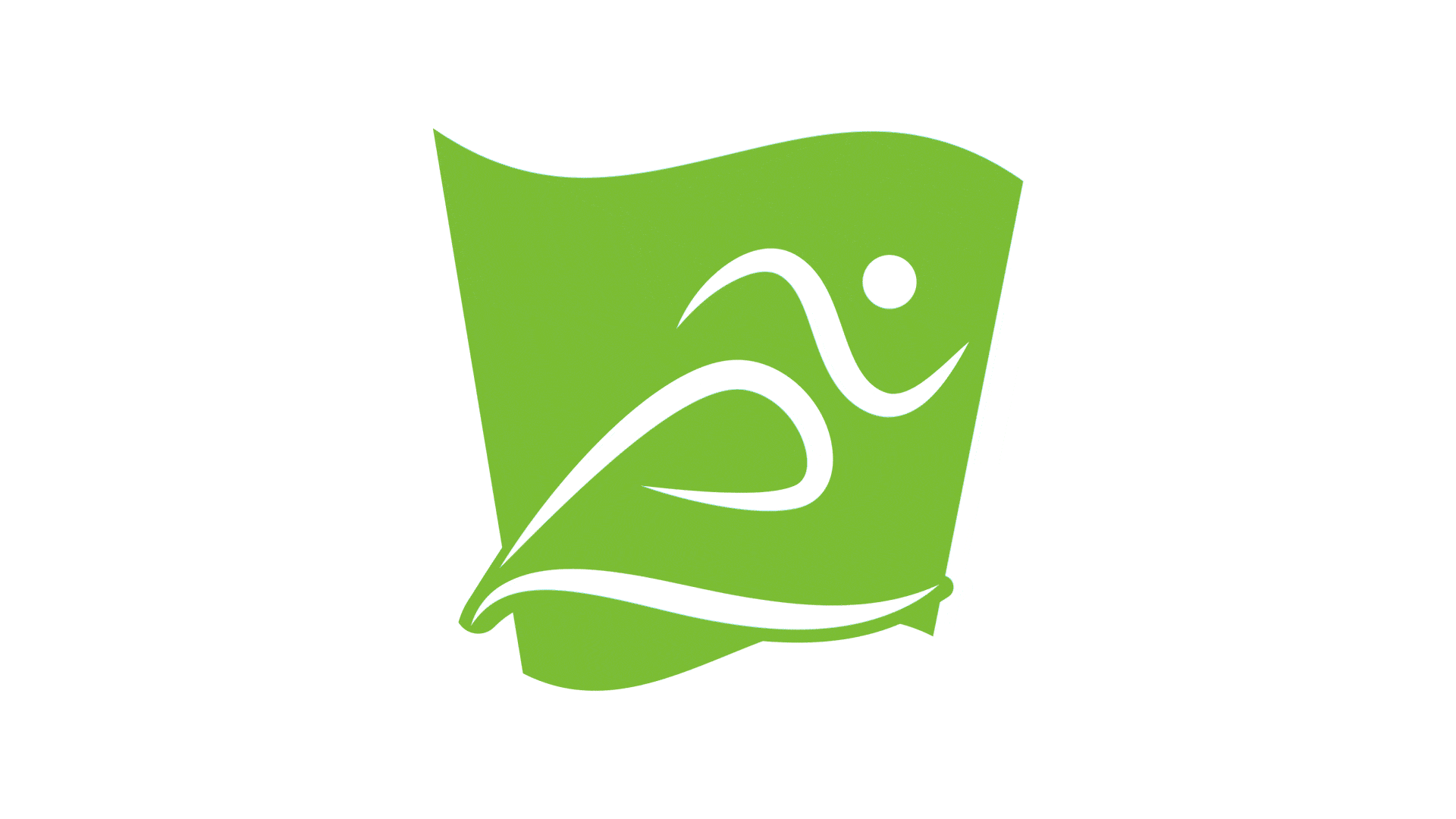
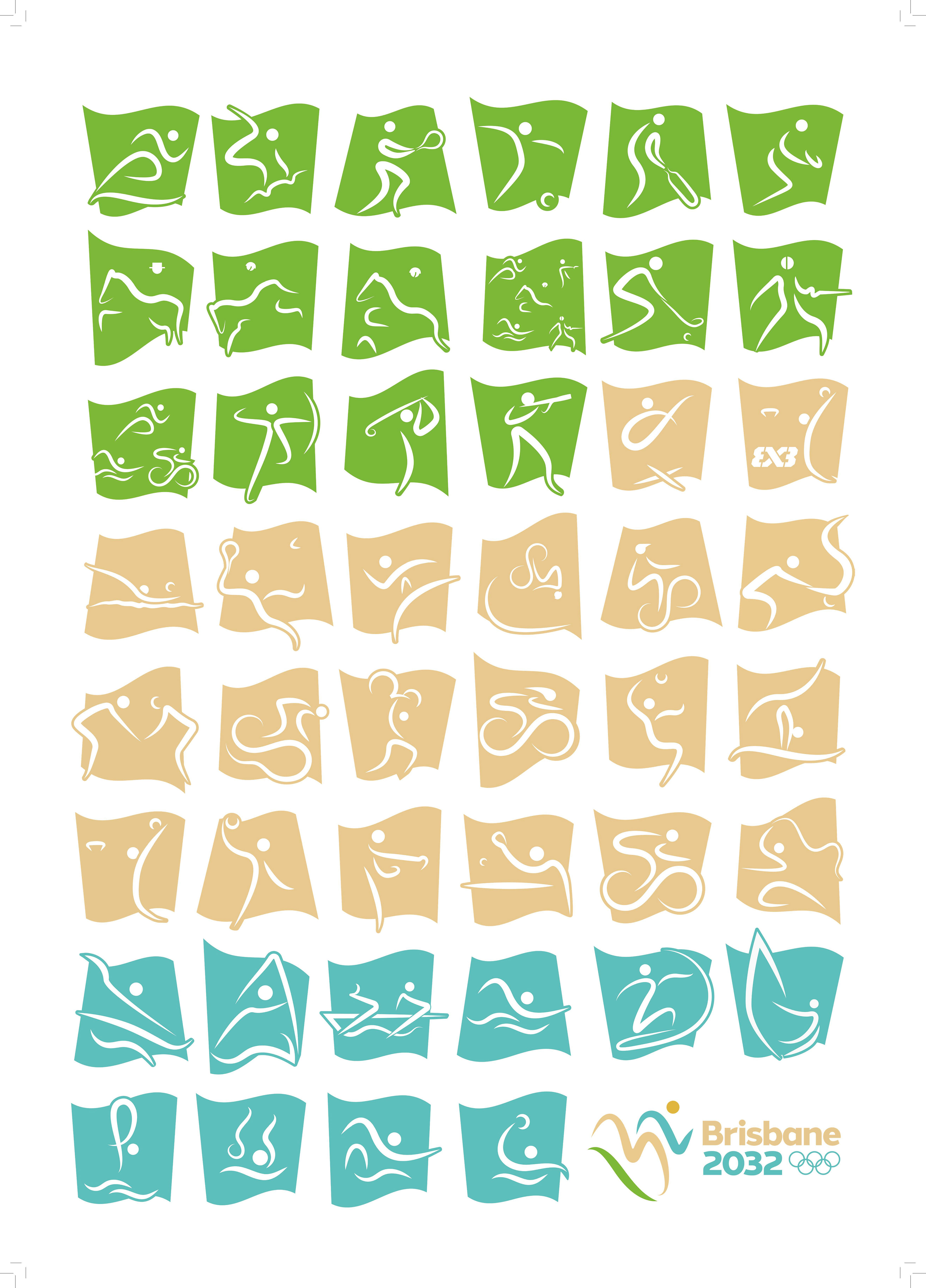
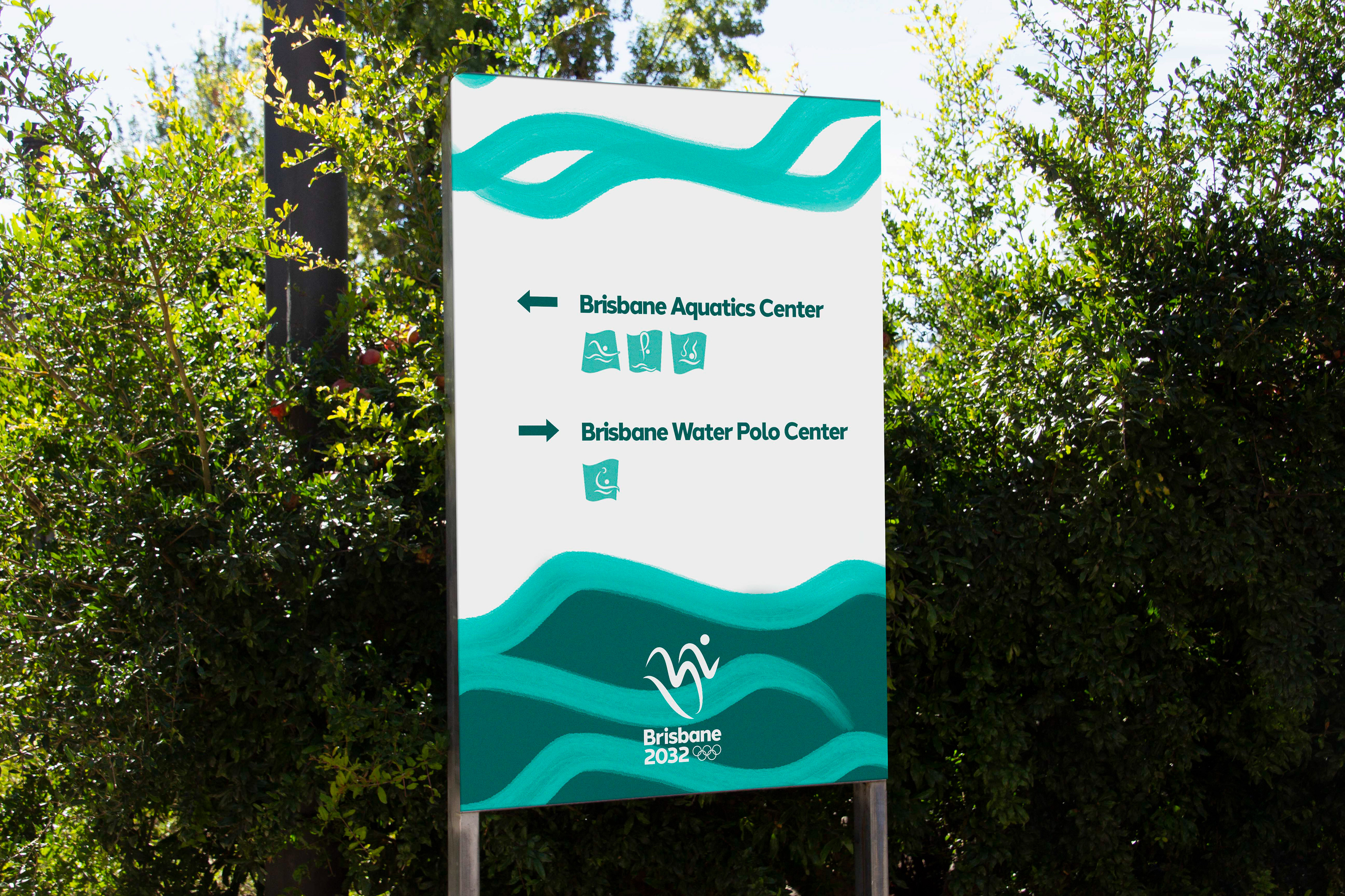
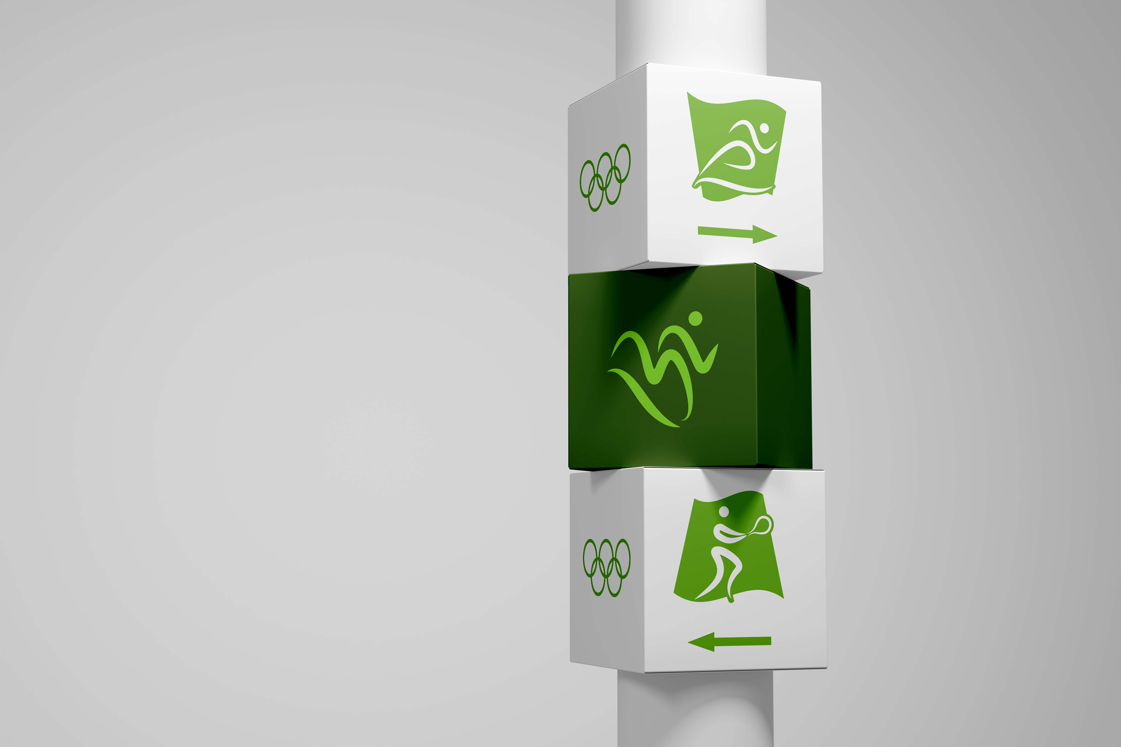
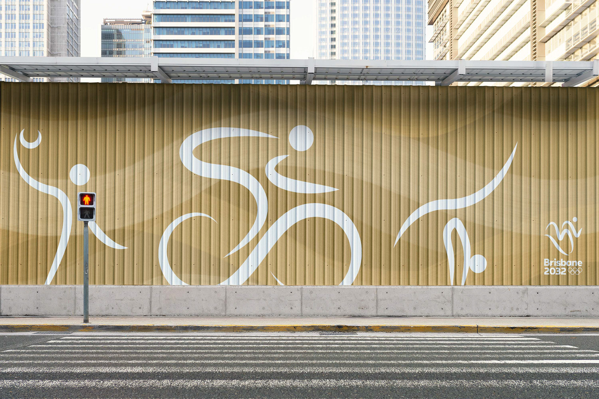
I also designed 46 sport pictograms. These are all based off the main emblem, using the wave form and consist of three lines and a circle. These, like the logo, represent the three terrains that make up Brisbane and the sun, a big part of the environment of Australia.
The three colours are also spread across the pictograms, with each environment matching suitably to the sport. The wave form is also continued in the back shape. Movement and energy run throughout the brand.

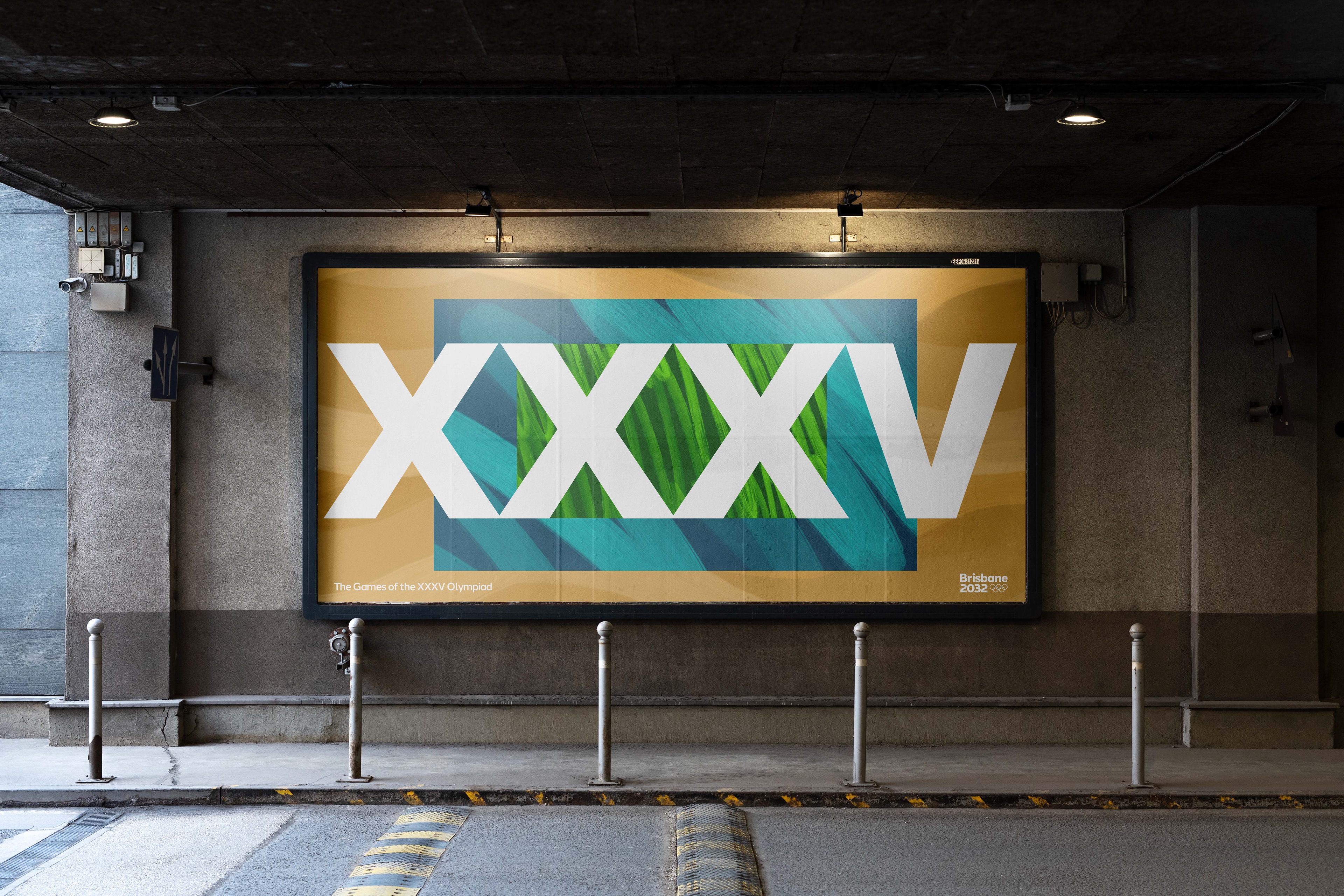

The typeface is Halcom, a warm and friendly font that reflects Brisbane's optimistic and forward-facing attitude. It also feels modern enough to survive the next 10 years. The colour palette is based off the natural, environmental colours. However these have been tweaked to still feel vibrant and attractive. The colour choice feels very different for the Olympics, making this brand fresh and unique to the past designs.