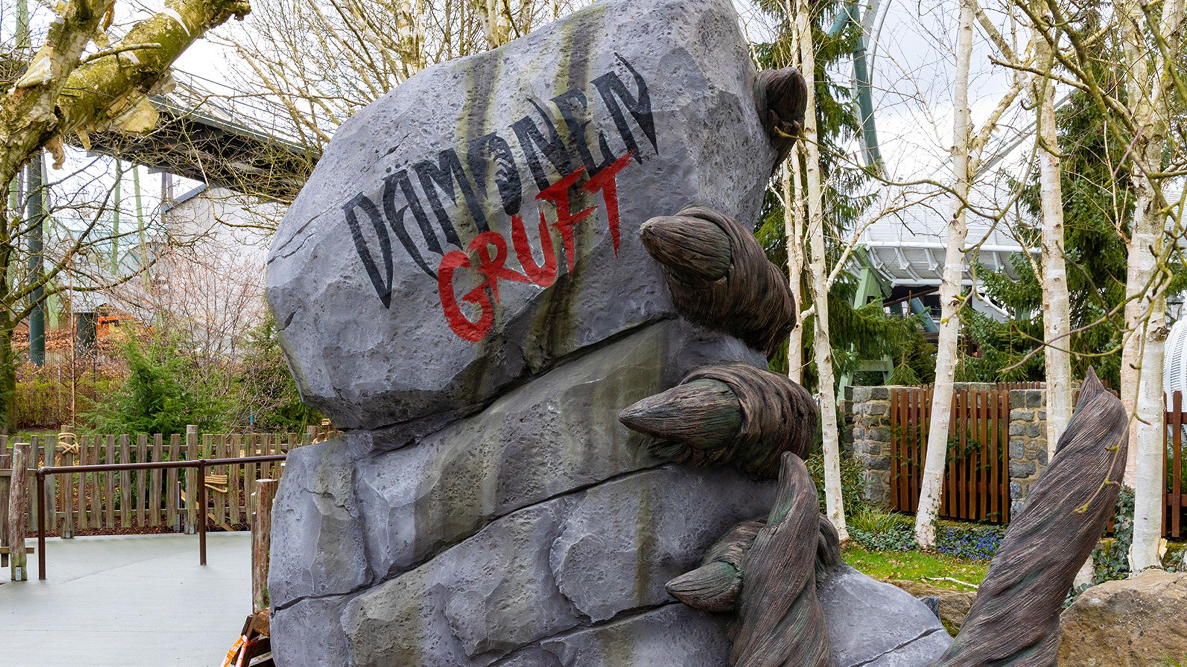
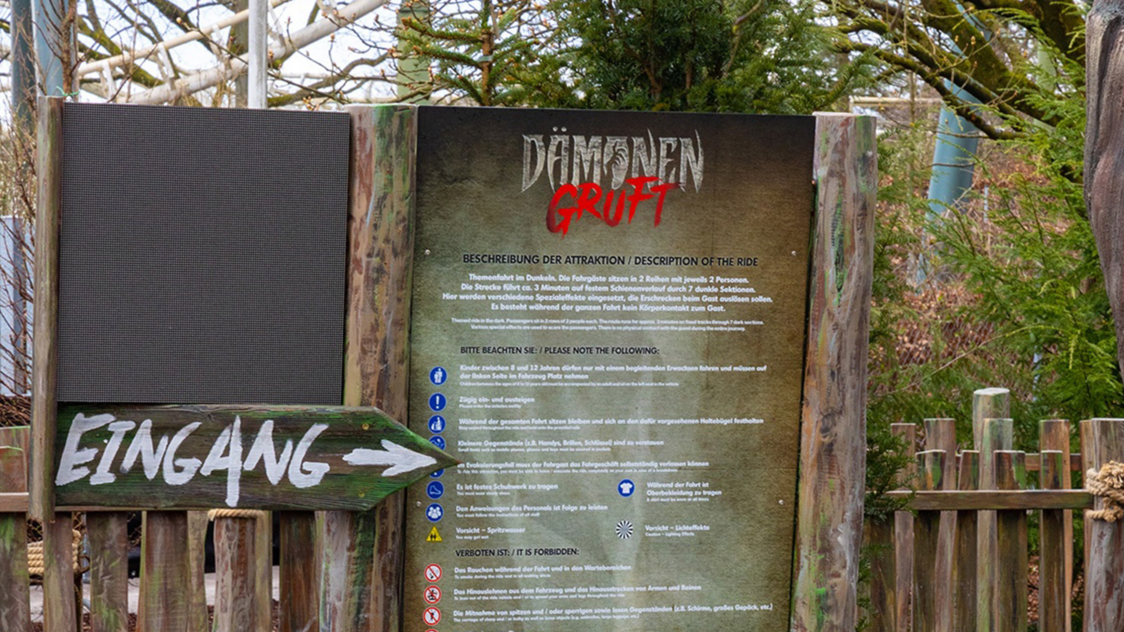
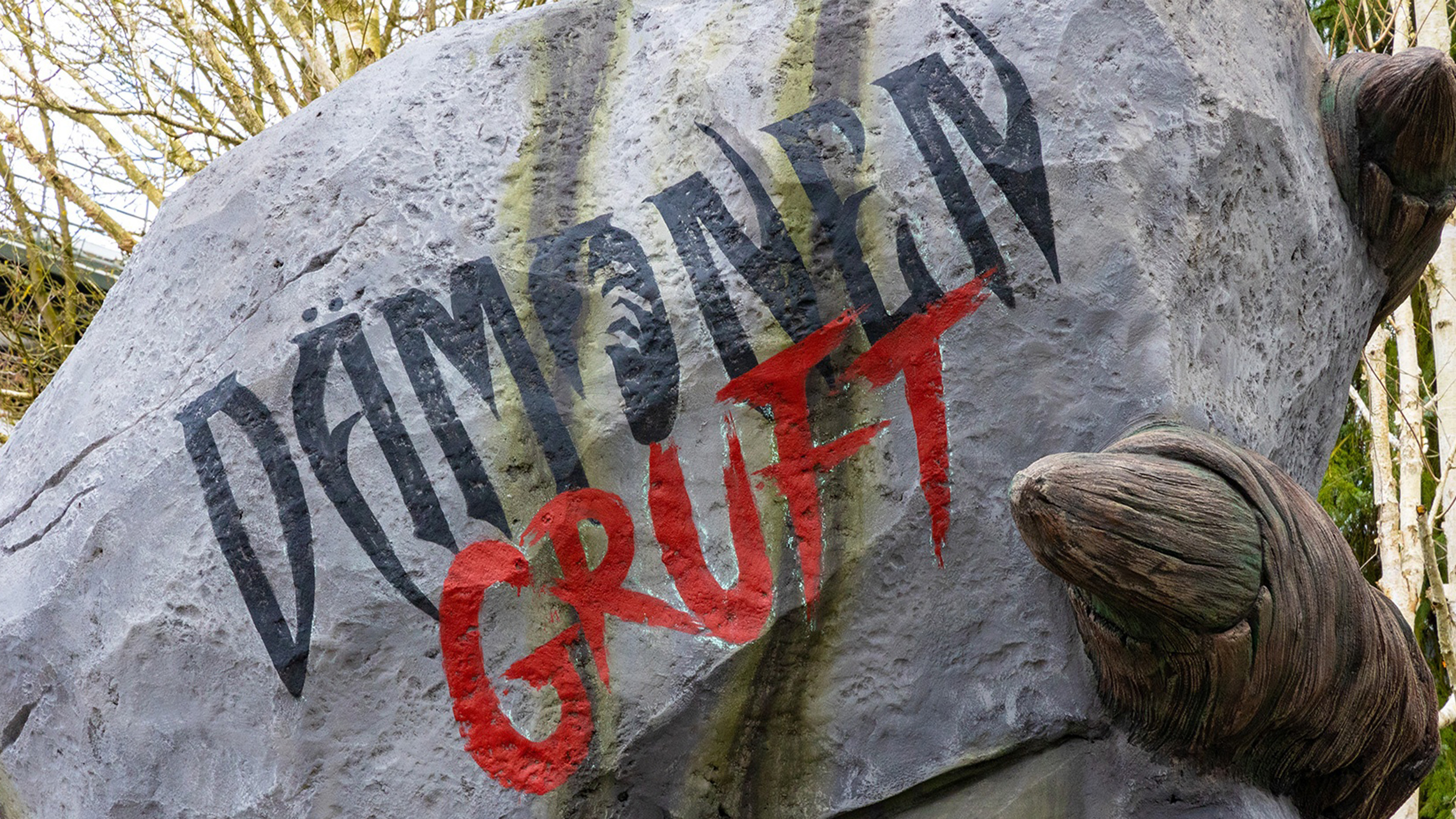
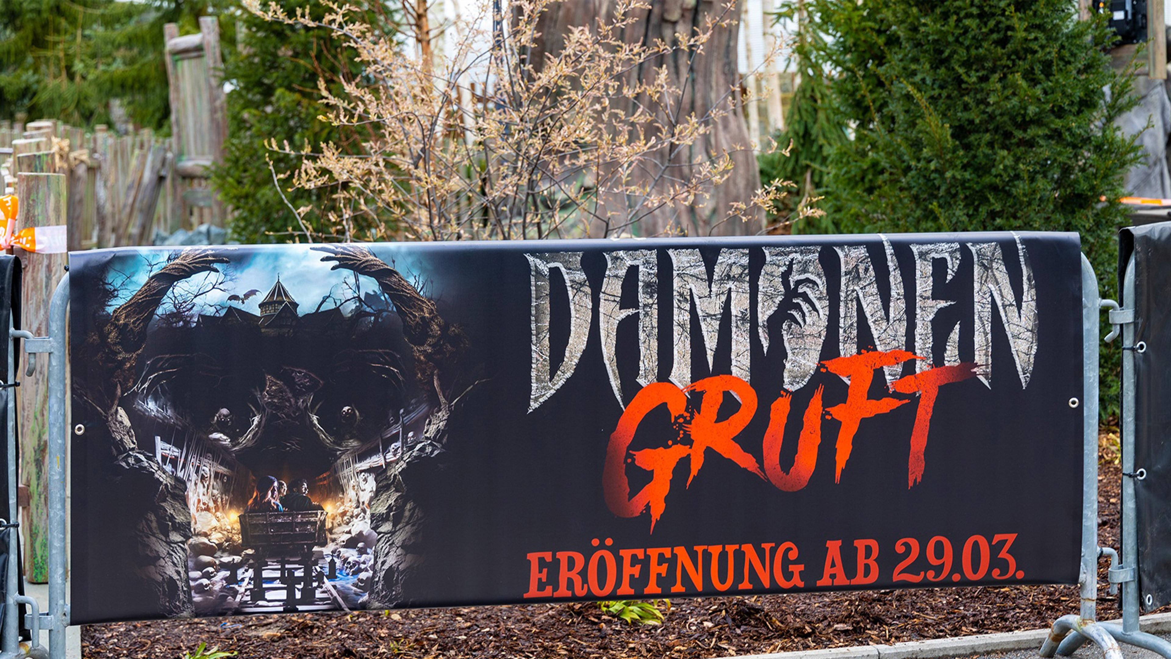
Germany's Heide Park has recently opened a brand new dark ride named Dämonen Gruft. The story surrounds an abandoned catacomb, that houses a dark secret. The identity needed to reflect the logo of another ride in the area, Flug der Dämonen as this new ride continued the backstory from Flug. The typeface was maintained from this original logo but with the addition of the 'hand-carved' Gruft.
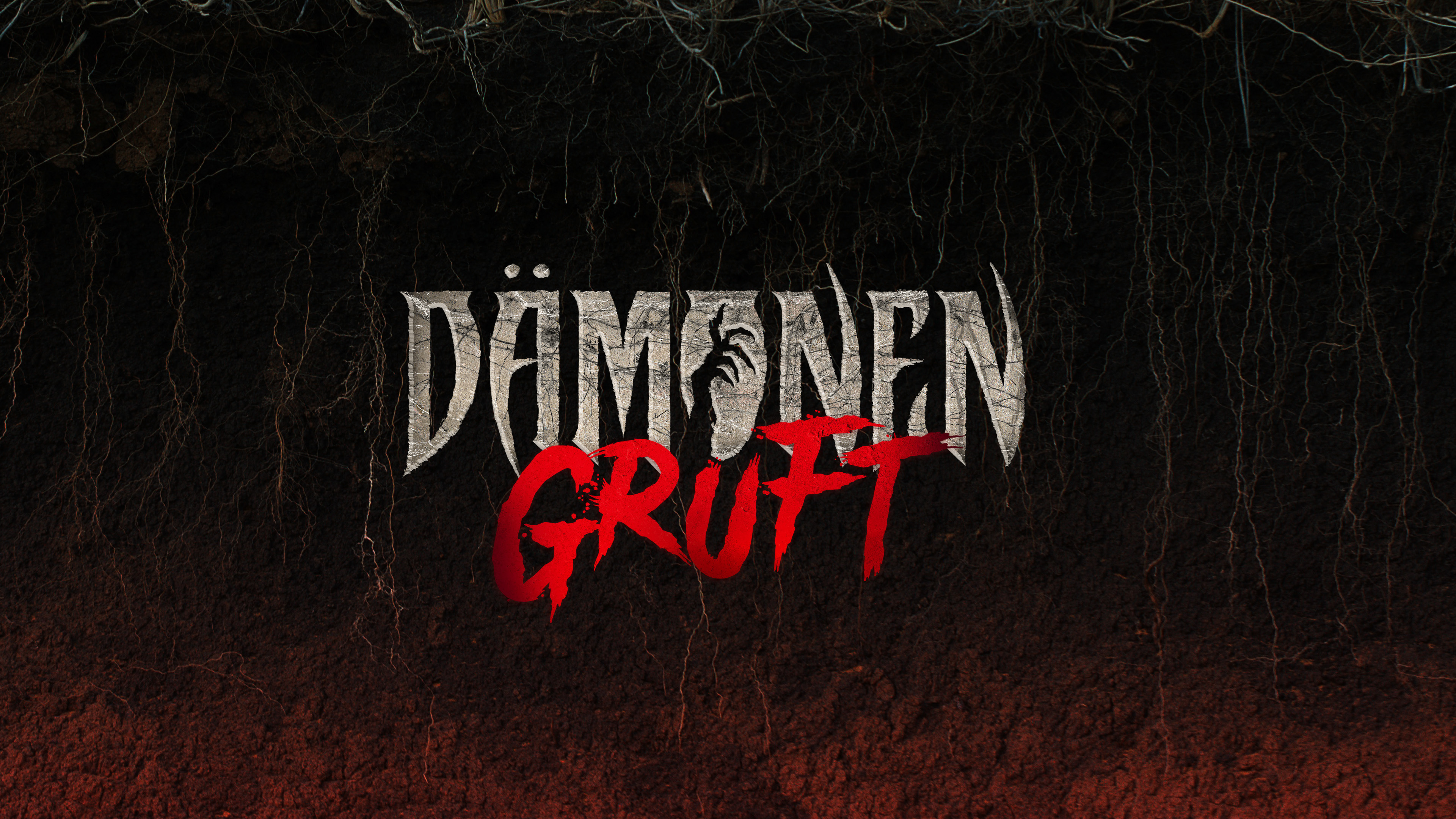
The logo went through many iterations, some more elaborate with a symbol as well as the wordmark. However the decision was made to keep the type on its own. The hand that can be seen in the negative space is derived from the large theming piece at the entrance of the ride.
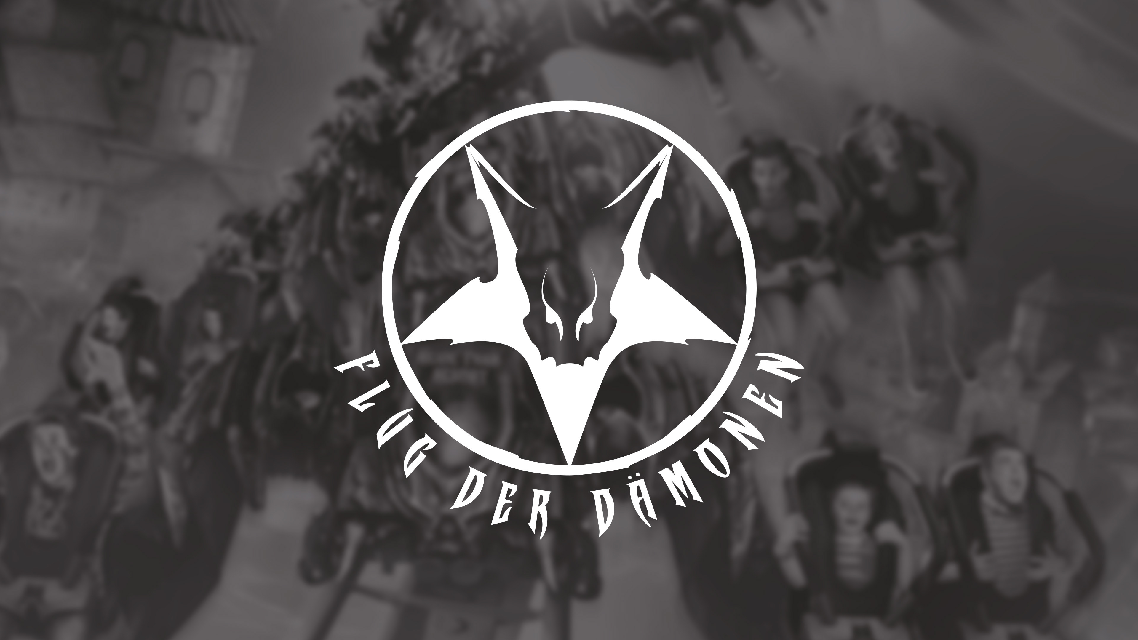
The ride logo for Flug der Dämonen for reference. The major ride in the area that the new dark ride is based off. The new logo had to have resemblance to this one, yet still have its own identity.
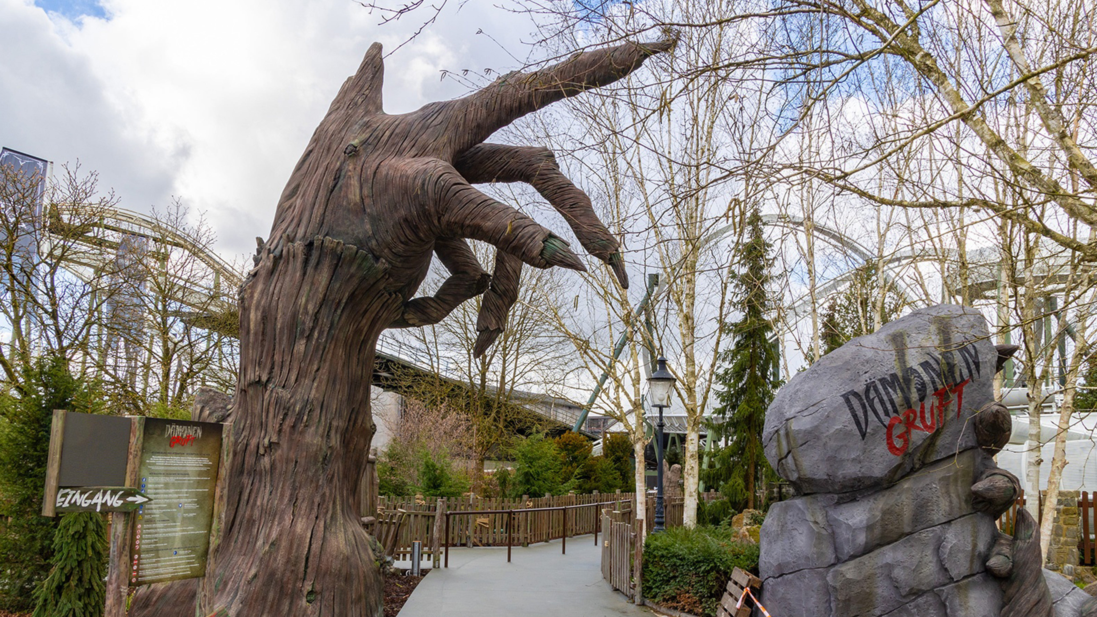
Work completed at LMC Design 2023. Photography courtesy of Kai Schulte (Heide Park World).