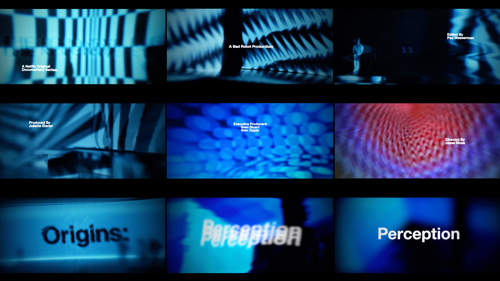
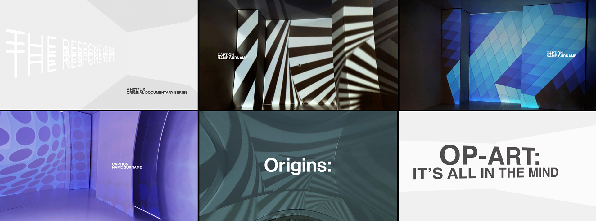
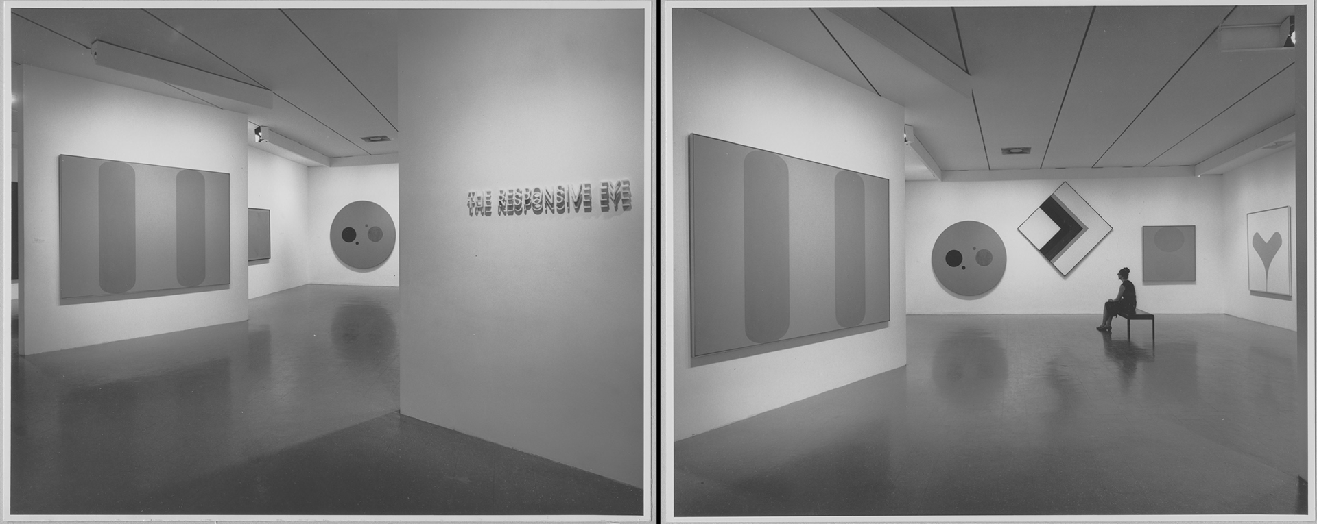
For a fictional Netflix documentary about the beginnings of the Op-Art movement, a title sequence was needed. For this I decided that I wanted the to take the 'hand-made' origins of the art form into my own work. From researching, I also found that its popularity came from an exhibition in New York called The Responsive Eye.
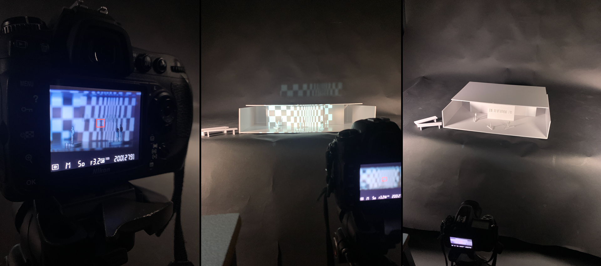
I created a replica of the exhibition space using foam board. I then projected animated pieces of Op-Art work to create a visually stimulating effect, similar to how Op-Art does. By producing this, it represented the main location where the movement started. Using a DSLR and specific lighting choices, a grainy, desired effect was created. This reflected the quality of 1960s film, the year Op-Art became the renowned movement we all know and love.
In early versions of this title sequence, I wanted to use anamorphic projection as a way of producing the credits, however this was not a viable option with the facilities and time management I had to deal with. Instead the idea of projecting images came to light. Distorting them in such a way that they almost become pieces of art themselves.
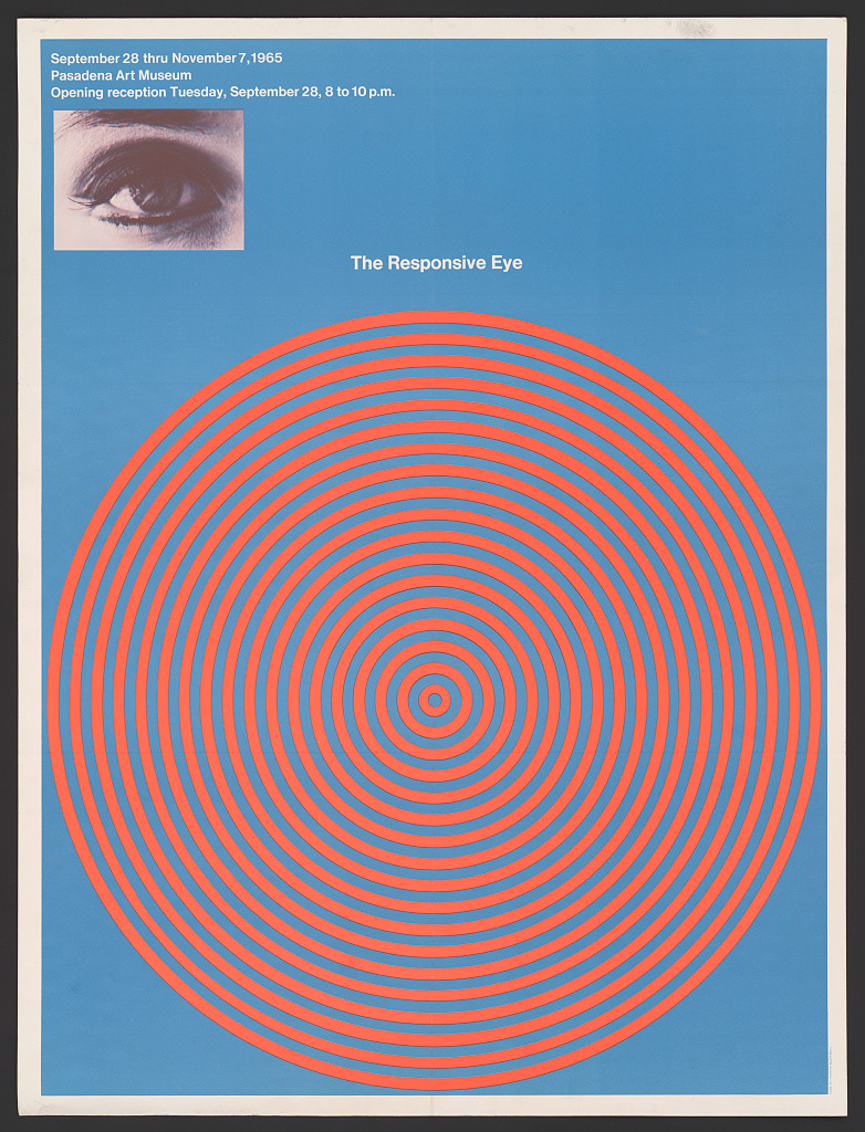
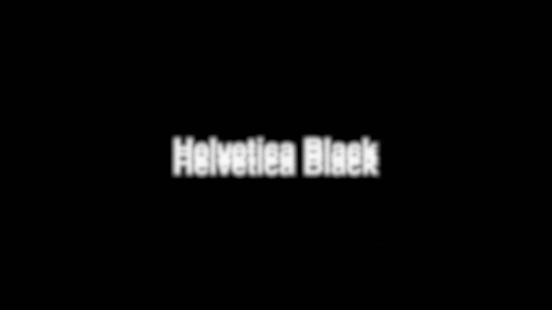
The use of type in this sequence has been inspired by the poster for the original exhibition. The title is set in Helvetica, common in the 1960s. In addition, the logo has the type repeated three times and layered, playing with this idea of optics. This has inspired the motion of the type, moving together and layering up to produce on single layer of type.